Carbon dioxide emissions may be reduced by two means: (1). Limits (2). Taxes. The difference between the two approaches is whether we choose a vertical control or the horizontal control in the supply-demand diagram, and they both have their pros and cons.
Limits on CO2: Caps
Let us first consider limits (or "caps") on carbon emission. Intuition tells us that if the limit is higher than the amount currently emitted, then the CO2 price is zero, and there is no change in the amount of CO2. So, the first requirement is that the limit set should be less than the amount emitted. This might seem obvious, but could pose problems during early stages of implementation if the emitted amounts are not known with a high degree of confidence. In fact, this uncertainty wreaked havoc in the European Emissions Trading Scheme (EU ETS) , where prices collapsed after it was discovered that the caps were set too high.
 Fig. 2. Price of energy vs. the quantity of CO2 emitted in the presence of a limit (Cap). In this case, the price of electricity = marginal cost + cost of CO2.
 When the limits are set lower than the current levels of emission, then equilibrium requirements dictate that the price of electricity has to rise sufficiently such that the intersection of the demand curve with the limit is now the price of electricity. Since the cost of the electricity by itself (production cost) has not changed, the difference between the two horizontal lines is therefore the cost of CO2.
Now, cost estimation can be done given the limits and the demand curve. Since limits are not set yet, and the obtaining the demand curve is non-trivial, we have to resort to other means for estimation. We can use the range of prices observed in the European market as a guide to estimate. (Note that the CO2 price is completely determined by the limits being set and the demand curve, and therefore, the regulator can choose any value such that the price falls in a desired band.)
The calculations are given below, along with the assumptions and the sources of the data.
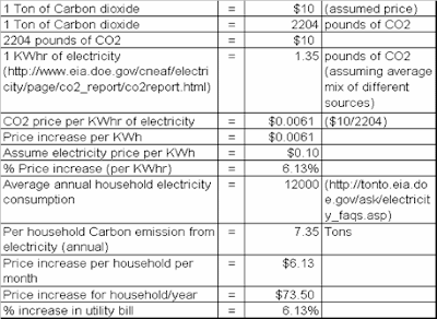
Therefore, under the simple assumptions that we listed above, the average house-hold is likely to spend $6.13 per month higher once the legislation is introduced. If the carbon price increases, the amount will also increase. The plot below shows the linear relationship (Additional amount spent = 0.613*Price per Ton of CO2) between the carbon price and the additional amount to be spent by the household.

 The price increase per household is $73.5 per year, and there are 110M households in the country, leading to $8.5B/year. This calculation is for carbon emissions from electricity only. The total size of the carbon markets can be estimated as ~6B Tons of CO2 at $10 being ~$60B in the early stages.


